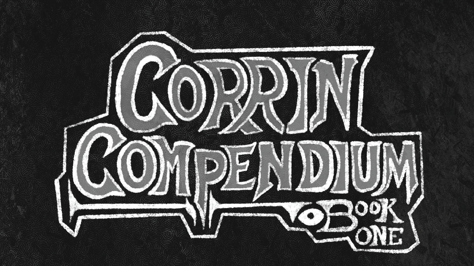
Corrin Compendium
Case Study - Personal Project
The Project
My personal project is part of a larger ongoing personal project of an approximately 200 page compendium of 3rd party content for the Tabletop Roleplaying Game: "Dungeons & Dragons", of which all the content had been written by me over the last three years. Every single part of the project is made by me, including the art, graphic design, written content, etc.
As I said, this was only part of a larger ongoing project and the final plan is to sell the entire book and likely continue on it once it's all done on my own Patreon.
Problem Statement
As this is a 3rd party supplement for D&D that I do eventually plan to monetize, I cannot simply go and write or include whatever I want. A big problem was rewriting content in a way that I can illustrate for that still falls within the guidelines of what I can include according to their Open Gaming License and System Reference Document for 3rd party content. This means, it being something intended to be a mirror realm version of official content, needed to be rebranded halfway to a simple compendium of random items. I had to revamp certain content to not include or illustrate content not within the guidelines such as the feral curse barbarian page having previously been directly referencing the wild magic barbarian which is something from the official book "Tasha's Cauldron of Everything", which was not part of the content I could legally include.
Research / Design Process
While there are a lot of competitors for 3rd party content when it comes to D&D, that didn't really bother me as, for the most part, this project is purely for personal gratification despite the want to eventually monetize it.
With the intent being that most of the content within the book is meant to be the opposite of content from the main core books released by Wizards of the Coast due to it supposedly being of this mirrored version of official content, many of the design decisions started from trying to find out the exact opposite of how their books are made such as placing pages at the top of the page instead of by the bottom, having a mostly dark color scheme as opposed to a light one, the choice of a very jagged and metal font vs. the elegant sans-serif one often seen in the core books, etc.
I, then, sent out previews to active D&D/TTRPG players to review rather than other graphic designers to see what the actual audience thought of it, making any adjustments if necessary. Most reviews involved small items such as difficulty in legibility due to originally having slightly too dark text on a dark background or confusing art choices which were rapidly changed.
Gallery


Conclusion
In the end, this project, primarily in terms of graphic design, presents my ability in illustration and page layout, not showed in most other projects in my portfolio which feature mostly animation. Additionally it highlights my artistic style in another light it isn't often shown in as it still keeps this very dark, gritty and sketch-heavy illustration while still not delving too far into the chaotic nature I normally try to create.
Additionally, as said earlier, as it is now, this version is still only but a preview of a larger book I plan to create. Most of the written content needs to be reviewed but, for the most part, the book only needs everything to be put together on the page. However, I also plan to turn this into an even longer term project, eventually introducing it to more people and maybe get some friends onto the project as well as I turn it into a series of books which is why I write on the cover of the book "Book: One".
You can view a preview PDF here.